

The RITC BC Bike Infrastructure Index 2026
Do you ever look at the various bike network rankings that come out and think they don’t make much sense? That’s been my perception every time such lists come out, so I was curious if a simpler analysis would tell a different story. Who has the most All Ages and Abilities (AAA) bike infrastructure in BC? Will the usual suspects come out on top?
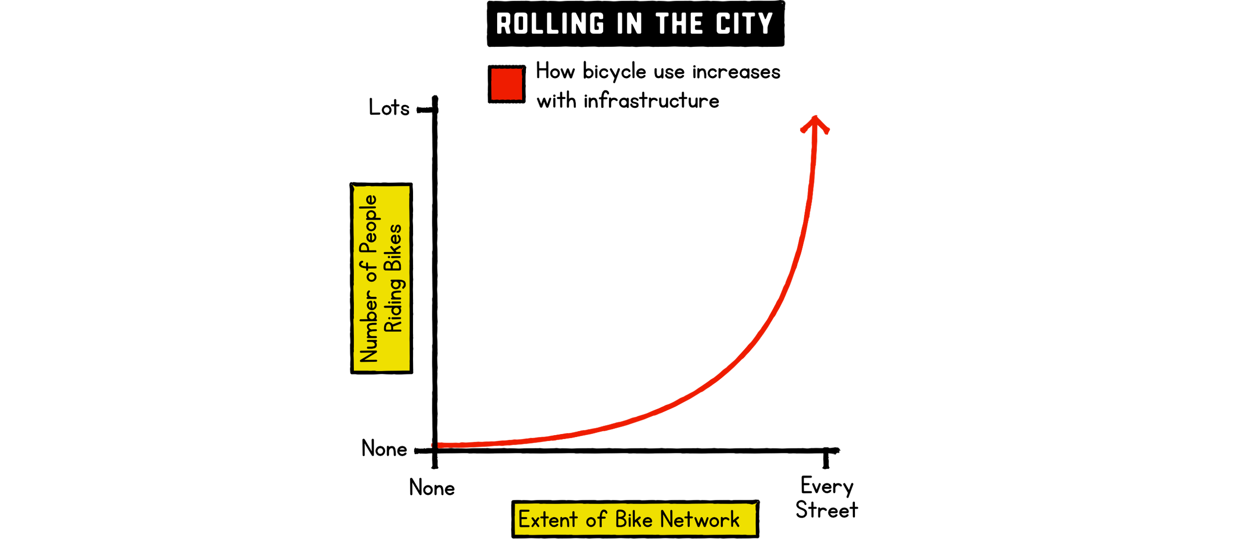
What’s the point of this index? Largely to satisfy my own curiosity about who’s doing what… I see most cities in the Netherlands sitting to the right of the chart below. They’ve spent around 50 years building out their bike networks and are now reaping the benefits. In BC, a few cities are sitting around the middle of the curve and at the point where things are starting to take off! Vancouver has been doing this for around 16 years since the Hornby bike lane was added in 2010. Victoria began their journey just 10 years ago, with the Pandora Avenue bike lane recently celebrating its 10th anniversary. That’s inspiring others, and many other cities are in the early stages of their journey, maybe at the point where people complain that no one is using the infrastructure, without appreciating that it takes a connected network, and that is a long-term objective.
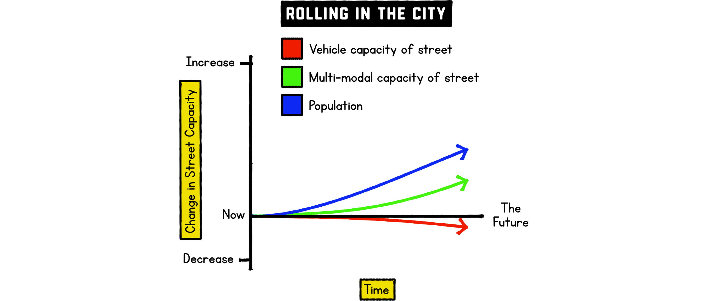
By why is that a long-term objective? Why are cities investing in bicycle infrastructure? Why do we need more people riding bikes? It’s not a war on the car, and it’s not a bike bias; we need more people walking and taking transit too… Our city streets simply don’t have the space to expand; even if they have the space, the cost is most often prohibitive… The red line will never match the blue line in the chart below. If anything, as vehicle size keeps increasing, the vehicle capacity of a street might actually be decreasing even without any bike lanes… As population increases, we need more ways to move more people in the same space… That means more space efficient ways of getting around…
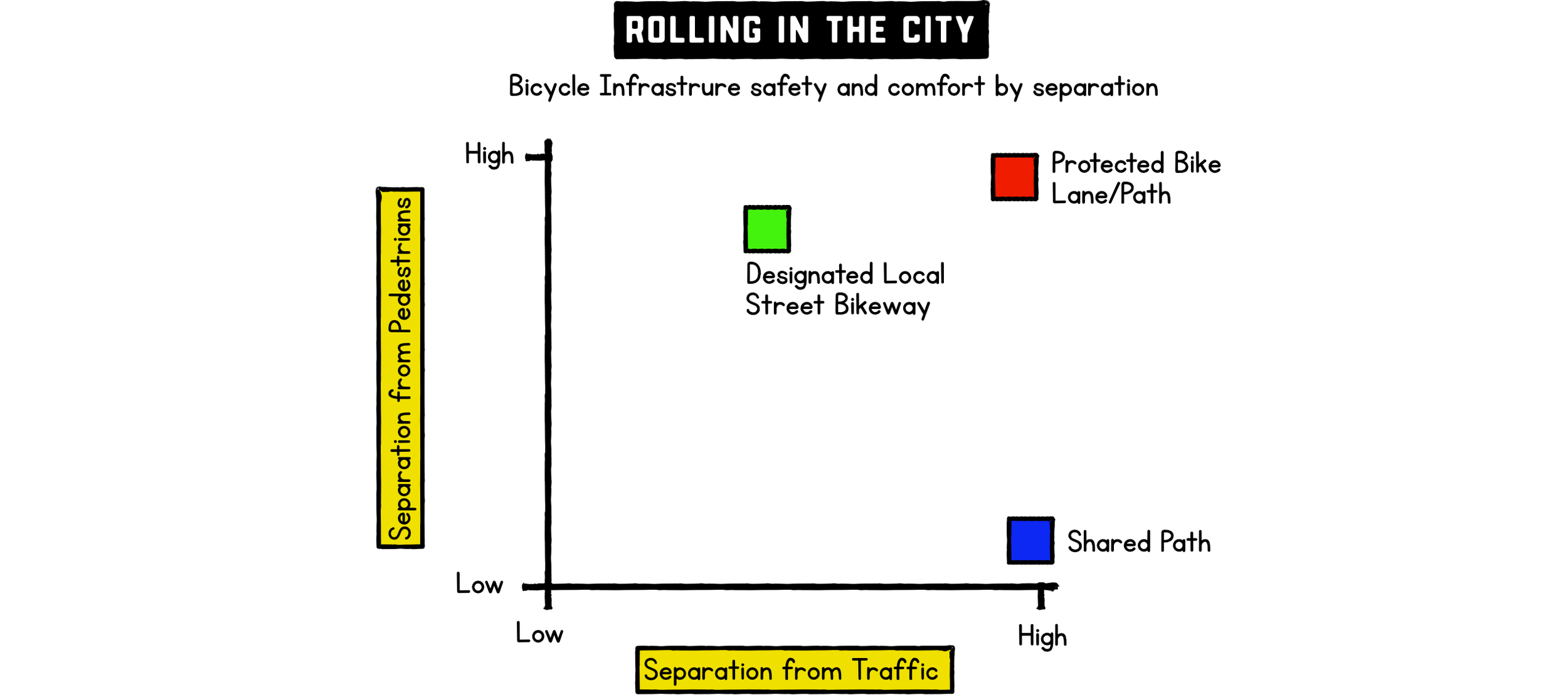
To increase mode share for transit, we need frequency, speed, and reliability… To increase mode share for walking, we need compact mixed-use development, good sidewalks, and safer intersections… To increase mode share for cycling, we need separation from other modes and safer intersections… Nothing does that better than protected bike lanes or paths. Shared paths generally feel comfortable as they are separated from traffic, but they introduce conflict with pedestrians, and while designated local street bikeways generally encounter less traffic, the possibility of conflict is still there… Those three facility types are the focus for this index, but it’s the protected bike lanes that really get people cycling, creating safe routes through the urban core to destinations people want to get to… That is why the index weights the facility types…
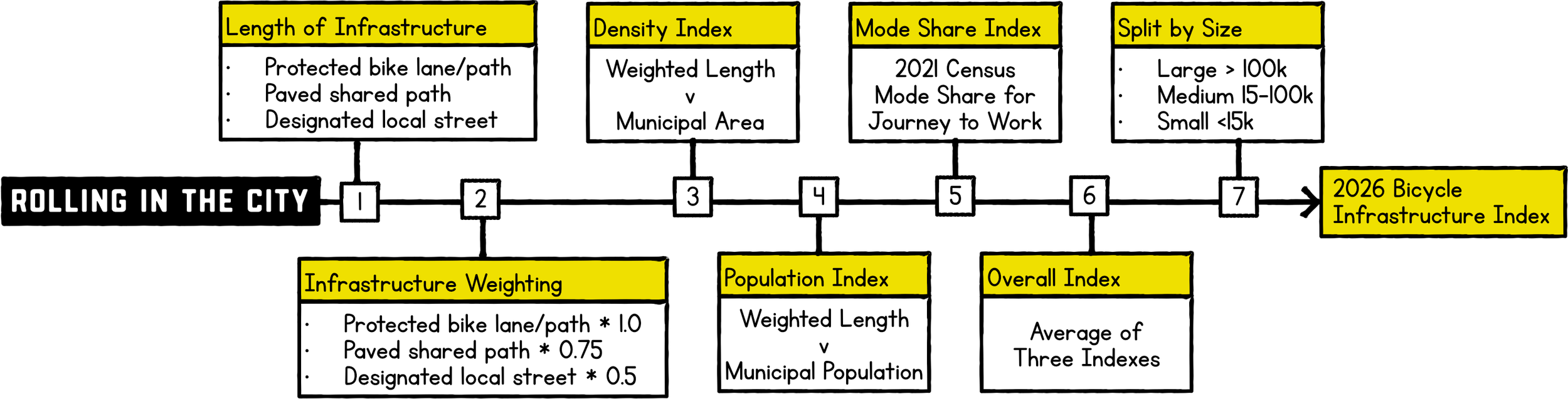
So that’s what we need and why… The process to calculate the index is summarized below and described in greater detail at the end if interested. I debated various ways to do this, and whether or how to split it up. None are perfect, but our approach gathers the length of all ages and abilities bicycle infrastructure, weights it by facility type, compares by area and population, compares mode share, and reports back in communities grouped by population. A score of 1.0 in any index means the community is the top performer. All scoring is relative to other communities in the index and the index is calculated for all communities together rather than individually within the size groups.
The Winners Are
I suspect Victoria and Vancouver are obvious but maybe everything else less so. For whatever reasons, be it network density, infrastructure per capita, or high cycling mode share, there is something in each of these communities that makes riding a bicycle more feasible. Are you surprised by any of these?
Also, if you wondered who the top three are for each index, unsurprisingly many of the names above feature heavily, but maybe not in the order you would expect…
Large Communities Top 20
This is really what I wanted to see, every time an index comes out and Victoria is not at the top, I tend to question it as they have a small compact community, are building new infrastructure every year and you can see it working by the number of people riding around. What might be surprising is that it is not quite top in terms of network density, that honour goes perhaps surprisingly to New Westminster, but I think their topography impacts their mode share, something that will be less of an issue with increasing e-bike adoption. It is the dense network in Victoria combined with a high mode share that lifts it to the top of the rankings in this category. It is no surprise that Vancouver is also up there with a high network density and mode share. Communities with a large natural areas such as Coquitlam or Maple Ridge will struggle based on density, hence why there is also a population comparison to provide some balance, for example Nanaimo has the same amount of infrastructure per person as Victoria, it’s just spread out over a much larger area. That really is a big part of the reason for Victoria’s success.
Medium Communities Top 20
The medium sized communities include a variety of community types so expect a bit of variation. We see Whistler leading the way due to the high population index score and good mode share, an outcome of the low resident population (it has a large hotel population), the extensive Valley Trail system, and the resort nature of the community. The density index is very low, but arguably the valley trail takes you where you need to go and the urban nodes are largely car free, albeit you might also get yelled at to walk your bike! The City of North Vancouver scores well with almost the highest network density score of all the communities (second only to New Westminster). Oak Bay at number three is an interesting one. It scores pretty low in terms of network density and infrastructure per capita, but it has one of the highest bicycle mode shares, likely the result of many relatively comfortable local streets, limited through traffic, and it’s proximity to Victoria.
Small Communities Top 20
The small communities category is interesting as despite often having less infrastructure, the lack of traffic and small size often make getting around by bicycle reasonably comfortable regardless of area. For example, Tofino comes out on top scoring highest in terms of infrastructure per capita and also has a high mode share, but the infrastructure is entirely the pathway to Ucluelet rather than an extensive urban cycling network. That pathway also feeds people into the urban core or the many destinations along the coast so I’m not discounting the utility of it for everyday transportation. These nuances are the reason that I split the communities into size groups, because Tofino is actually the highest scoring of all the communities in BC, but is an entirely different context to say Victoria or Vancouver. Valemount has a long pathway through the village so does well and a good commute mode share, and while Revelstoke scores poorly in terms of network density, it has the highest mode share in the province that elevates it’s overall score.
Curious What the data looks like on a map?
The map below is a visual representation of the data used to calculate the indexes. It uses the Bike Path (Paved)/Protected Lane, Shared Path (Paved), and Shared Road (Minor) categories for the index calculations… Note that it’s a downloaded dataset so will not live update if changes are made. That will have to wait for the next run of this index… If you want to open in a new tab click the link https://bcbikeindex.netlify.app.
Something not looking right in your area?
Click on a segment to show the tags and a link to that segment in OpenStreetMap. OpenStreetMap can be updated by anyone… If needed, we might even be able to help with that, so reach out to Dragana… If you want to do it yourself there are many ways to tag the infrastructure, below are some examples of tags we’ve used to classify the infrastructure:
Hornby Street Bi-Directional On-Street Protected Bike Lane in Vancouver
highway:cycleway, oneway:no, surface:asphalt
Guildford Way Uni-Directional Raised Protected Bike Lane in Coquitlam
highway:cycleway, oneway:yes, surface:asphalt
Johnson Street Multi-Use Pathway in Coquitlam
bicycle:designated, foot:designated, highway:cycleway, oneway:no, segregated:no, surface:asphalt
Trans Canada Trail on Burnaby Mountain
bicycle:designated, foot:designated, highway:path, surface:gravel
Ontario Local Street Bikeway in Vancouver
bicycle:designated, highway:residential
More information on tagging is available here if you really want to get into it: https://wiki.openstreetmap.org/wiki/Tags
Methodology
Below is a more detailed methodology:
Infrastructure is focused on paved all ages and abilities (AAA) infrastructure including protected bike lanes or paths, paved shared pathways, and designated local streets for bicycles. This analysis uses data extracted from OpenStreetMap (© OpenStreetMap contributors) in April 2026, available under the Open Database License (ODbL) and this has been processed and analyzed for this blog post. The accuracy of data can vary by community, but is often more up-to-date than larger mapping platforms. Data for one-way bike lanes is halved to avoid double counting compared with two-way facilities. A weighting is applied to favour better protected infrastructure, 1.0 for protected bike lanes and paths, 0.75 for paved shared pathways, and 0.5 for designated local streets to calculated a weighted total length in kilometres of AAA infrastructure.
The network density index provides the best measure of how easily you can get around the entire community. It’s based on the weighted length divided by the area in square kilometres. The more infrastructure per square kilometre, the better connected the community should be and the more destinations accessible by bicycle. This index favours the more urbanized communities.
The population index provides an alternative perspective, comparing communities by how much infrastructure is provided per capita. It’s the weighted length divided by the 2025 population estimates and calculated per 1,000 people. This helps counter the bias above, so a community with large land area but small urban core can rank higher in this index and this hopefully provides some balance to the overall index.
The mode share index is an indicator of the outcomes provided by the infrastructure based on the 2021 Census. It is not a perfect indicator… For one it was last measured during the COVID-19 pandemic so that likely skewed things. It only includes trips to work, and it will of course be biased by factors other than infrastructure such as community size and topography. As it is for 2021, it’s not aligned with community infrastructure if they’ve built any infrastructure since that time. It also benefits those communities on the edge of communities building a lot of infrastructure. But as far as I know, it is the only available province wide indicator of mode share. When we do this again next year, hopefully there will be a better alignment between infrastructure and mode share.
The overall index is the average of the three indexes, hopefully providing a somewhat balanced analysis of the bike network and use in each community.
Communities are grouped into population size categories of large (>100,000), medium (15,000-100,000) and small (<15,000), and while communities within these categories for sure have different characteristics, it’s a simple way to split them up to provide a more reasonable comparison than grouping them all together.
I’ve highlighted the top 3 winners in each size group and for each individual index, and provided a data table with the top 20. There are around 160 municipalities in BC so this keeps it manageable. This is intended to showcase those doing well, and those hot on the heals of the top three rather than name and shame. Municipalities have many competing needs for their budgets, bicycle infrastructure is just one of them… And as I said in the early paragraphs, the Dutch started this over 50 years ago, many communities in BC are just a few years in. Let’s see how it changes year over year…
What’s next?
A review on an annual basis, maybe some interesting comparisons with other cities in Canada or even other countries… I wonder how Utrecht compares for example… Or perceived another way, how much work do we need to do to get to Utrecht levels of bike mode share? Maybe even some data about the cities featured in future blog posts…